Phase 1 of The Healthy Online Marketing Path: Branding
Have you ever seen a daycare with alphabet blocks spelling their name? Or a college jersey with distinctive block lettering?
Those recognizable elements distinguish the brands from each other, but also give you a clue as to the experience you will have when you interact with the brand.
Establishing your business or organization’s branding is the first step on the path to healthy online marketing.
Before we talk about what branding is, let’s talk about why we need branding.
Branding is important so that wherever people find you- social media, website, print mailers, your office- they will recognize you, remember you and continue doing business with you. Consistent branding gives recognizability so that the reputation you are building does not get credited to or confused with someone else. Branding includes both online and offline elements.
Now let’s get into what branding your business looks like.
It all boils down to: Colors. Lines. Shapes. Tone.
Combined they become the manifestation of your reputation. Your logo. Your letterhead. Business cards, stickers, pens, signs. Anything you distribute to increase brand awareness. That’s the fancy way to say “Get your name in front of potential customers”.
Colors have a personality. Fonts can be formal or informal. Tone of voice can be anywhere along the spectrum from casual to professional.
Before you can choose color, shapes, fonts that reflect you, you have to know who you are. How do you want to be known in your community and by your customers?
Does the look of your logo and the wording you use give potential customers the impression you want them to have?
Here are a few questions to help you flesh it out:
Are you formal, casual, or playful?
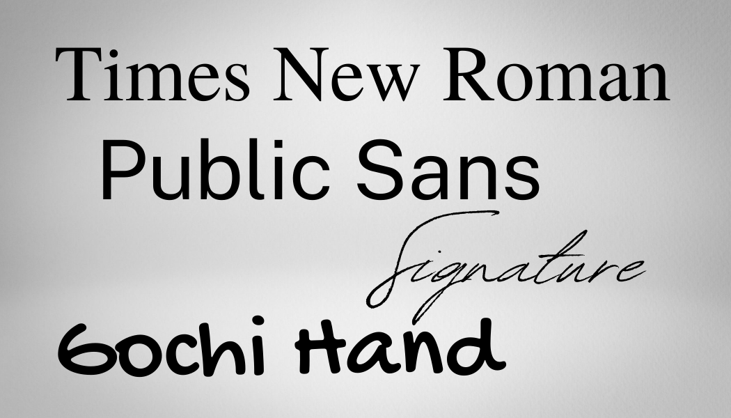
Choose a serif font for traditional or formal, a sans-serif for modern, and a handwriting or “script” font for either elegant or playful.

note: serif refers to the tiny line at the end of each stroke of a letter.
Example: Times New Roman.
Sans-serif fonts do not have the lines at the end of each stroke. Example: Public Sans.
Script can be anything from elegant like Signature to playful like Gochi Hand
Pro tip: many fonts are available free on the web. Be sure to use a credible source if you download a font.
How do you want people to feel about your business or organization?
Check out a color-personality chart to see which colors match up with the qualities you list. Adventurous, Energetic, Peaceful, Bold all have associated colors. Build your brand around a color scheme that accurately reflects your goals for your business
Pro tip: work with a design professional to choose colors that are related. Using colors in the same family will ensure your marketing pieces (website, business cards, brochures etc) have a cohesive look.
Are you a formal business or will you interact informally?
You may want to use slang or acronyms like “LOL”, but you may not. Neither is right or wrong, it depends on how you want your business to be known.
Pro tip: whatever tone you choose, consistency is key!
The fonts, colors and tone of voice you use all influence how people feel about your business. Be intentional.
Once you have all those questions answered, work through this comprehensive checklist to be sure you have all the important branding elements covered.
Checklist for establishing branding during Phase 1 on the Path to Healthy Online Marketing
Remember, your brand is your business’s reputation in a non-verbal format: color, line and shape – Make sure it says what you want it to say!
If you are overwhelmed with the demands of establishing a new business or an all-out re-branding project, Call or [email us] to see how our branding and strategy services may help you.
We’re here to help you have a beautiful and effective online presence so you can focus on your customers.
Next we will address establishing your online home base known as Your Website.


![One Thing You Must Do Online If You Have a Business [whether or not you have a website]](https://csdesign.online/wp-content/uploads/2-500x383.png)
